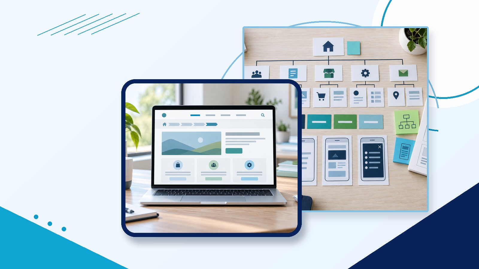
Website navigation should help visitors find the right page without guessing. A clear menu, simple labels, useful page grouping, and visible location cues can make a small business website easier to use.
Navigation is more than the top menu. It includes page names, links inside the content, footer links, breadcrumbs, mobile menus, search, and the way pages are organized behind the scenes.
When navigation is clear, visitors can move through the site with less friction. When it is vague, even good pages become harder to find.
Start With the Pages Visitors Need
Before editing menu labels, make a simple list of the pages that matter most. For many small business sites, that list includes Home, Services, About, Blog or Resources, Contact, and one or more key service pages.
Do not build the navigation around internal departments or owner preferences first. Start with what visitors are trying to do: compare services, check trust, find pricing clues, read answers, or contact the business.
Use Labels Visitors Recognize
A navigation label should make the destination predictable. “Services” is usually clearer than “Solutions” when the page lists services. “Website Content” is clearer than “Growth Studio” if the page explains writing help.
Clear labels also help visitors who scan menus quickly. If someone has to click a label just to understand it, the label is doing extra work badly.
Keep the Main Menu Short
A crowded top menu makes every choice weaker. Keep the main menu focused on the pages visitors need most often. Move secondary links to the footer, related-page sections, or a resources area when they do not belong in the main path.
A shorter menu does not mean hiding important pages. It means choosing the top-level categories carefully and giving each page a logical place.
Group Related Pages Clearly
Information architecture is the structure behind the navigation. If pages are poorly grouped, the menu will stay confusing even after the labels are rewritten.
Group related services, topics, and resources in a way that matches visitor expectations. A plumbing website may group emergency repairs, installations, maintenance, and service areas. A website studio may group WordPress, website content, SEO, and AI tools.
Show Visitors Where They Are
Visitors do not always enter through the homepage. Search engines, social posts, ads, and shared links can land someone deep inside the site.
Use clear page headings, readable URLs, active menu states, breadcrumbs when useful, and related links so visitors understand where they are and where they can go next.
Give More Than One Way to Find Key Pages
Some visitors use the menu. Others scan the page, use search, follow footer links, or look for related content. Important pages should not rely on one path.
For a small site, this can be simple. Link key services from the homepage, include contact links in the header and footer, and place related links near helpful page sections.
Check the Mobile Menu
Many navigation problems appear on mobile first. Labels wrap awkwardly, dropdowns become hard to tap, and important links disappear behind too many levels.
Test the menu with one hand on a phone-sized screen. The visitor should be able to open the menu, read the choices, reach important pages, and close the menu without confusion.
Use Clear Link Text Inside Pages
Navigation also happens inside the content. Instead of using vague links such as “click here” or repeated “learn more” buttons, write link text that describes the destination.
Good internal links can guide visitors from a general page to a specific service, from a service page to an FAQ, or from a blog post to a contact page.
Step by Step Navigation Cleanup
- List every important page. Include service pages, contact pages, resources, locations, and pages tied to leads or sales.
- Mark the top five visitor tasks. Identify what visitors most often need to find or do.
- Remove vague menu labels. Replace labels that sound clever but do not explain the destination.
- Group related pages. Put similar services, resources, or locations under clear parent categories.
- Shorten the main menu. Keep only primary choices in the header and move secondary links to better places.
- Add location cues. Check page headings, active menu states, readable URLs, and breadcrumbs where they help.
- Review mobile navigation. Test tap targets, dropdowns, menu closing, and label wrapping on a phone-sized screen.
- Improve internal links. Use descriptive link text that tells visitors what they will get after clicking.
- Watch a real person try it. Ask someone unfamiliar with the site to find one service, one proof point, and the contact step.
Simple Navigation Checklist
- Can visitors identify the main service pages from the menu?
- Do menu labels use plain words instead of internal brand language?
- Are key pages reachable from more than one place?
- Does each page show where the visitor is in the site?
- Does the mobile menu work without tiny tap targets or hidden links?
- Do internal links describe the destination clearly?
- Can someone find the contact step from every important page?
A Quick Before and After
Before: A website header includes Home, Solutions, Experience, Insights, Engage, More, and Contact. Visitors have to click around to understand where services live.
After: The header includes Home, Services, Website Content, SEO, Blog, and Contact. Footer links hold secondary pages, and service pages link to related guides and contact steps.
The second version is clearer because visitors can predict the destination before they click.
Final Thought
Good navigation is quiet. It does not call attention to itself. It simply helps visitors move from question to answer, then from answer to action.
If visitors keep asking where to find something, the navigation is giving you useful feedback. Use it to simplify the path.